 Much has changed along the journey from typewriters to setting type on computers. Still, there are a number of typewriting conventions that are no longer relevant but which stubbornly refuse to go away. At the top of this list is the practice of putting two spaces between sentences. Forget about tolerating differences of opinion: typographically speaking, typing two spaces before the start of a new sentence is absolutely, unequivocally wrong.
Why We Do It
Why is typing a double space after the end of a sentence such a common practice? And why do so many writers still deliver copy this way? The answer: typing class! This is how most of us were taught to type (and still are, in many cases). The two-space habit is based on the limitations of typewriters; specifically, of typewriter fonts.
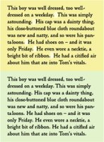
Typewriter fonts are monospaced, which means that every letter, whether it’s a wide letter such as ‘m’ or a narrow letter like ‘i’, takes up the same amount of space. This makes for very open-looking spacing, so the convention of adding an extra space between sentences was established to achieve a noticeable separation between sentences.
Conversely, nearly all computer fonts (except Courier) have proportional spacing, which means that the width of the characters and the spacing surrounding them are in proportion to each other. Proportional spacing results in a more even, balanced appearance. Because of this, a single space is enough to create the necessary visual separation between sentences.
No More Seeing Double
Since we’re working in the digital age, you are now the typesetter as well as the designer. It’s your responsibility to make sure the final copy is free of double spaces. Here are some suggestions to help achieve this:
- Educate the authors and editors who provide your copy about the differences between typing and typesetting, and request that they deliver typeset-ready copy without double spaces.
- If your copy already has double spaces, use your application’s search-and-replace feature to replace double with single spaces.
- Make sure to check any additional or corrected copy you might receive, especially if it arrives in emails or other casually typed sources which are apt to contain double spaces.
- Request that all proofreaders and copy editors who review your work flag double spaces as errors.
Source: www.fonts.com
You might also like:


Related posts:
- New novels by James Patterson
- Top novels for Teens 2014
- YA novels About cancer
- New novels to read
- Are novels real


Yes it should be double spaced. Flush left - ragged right . Indented first line of each paragraph - no extra line between paragraphs. 12 pt Times New Roman or Courier New fonts ONLY. Yes, it is so it's easier to read and so editors can work on it.